Heads up! We may use affiliate links in this post. You'll never pay more, but we might earn a small commission if you buy - thanks for supporting us! See our full disclosure here.
Want to make cheap wall art look expensive without emptying your purse? You’re not alone.
The art market can be intimidatingly expensive, with original pieces often costing thousands – but here’s the good news: creating a luxurious-looking art collection doesn’t require a gallery-sized budget.
In fact, some of the most stunning home galleries feature cleverly styled affordable pieces that look deceptively expensive.
Whether you’re decorating your first apartment or updating your home’s aesthetic, these proven strategies will help you create an art collection that looks thoughtfully curated and professionally installed, all while keeping your budget intact.
From strategic framing to expert lighting techniques, let’s explore the essential methods that top designers use to make cheap wall art look expensive.
1. The Frame Game: Your Most Powerful Tool
Choosing the Right Frame
When it comes to elevating affordable art, frames are your secret weapon. Here’s what professional decorators recommend:
Material Matters
- Opt for solid wood frames in classic finishes like walnut or black
- Consider brushed metal frames for a contemporary look
- Choose acrylic frames for a modern, floating effect
Sizing Strategy
- Always go for oversized frames with generous matting
- Add 4-6 inches of frame width to create presence
- Consider double matting for extra sophistication
💡 Pro Tip: Thrift stores often have high-quality frames at bargain prices. Look for solid construction and reimagine dated frames with modern spray paint.
MORE POSTS YOU’LL LOVE:
- Newstalgia: Revolutionising Homes With Timeless Charm and Cutting-Edge Style
- 22 Easy Ways To Make Your Bedroom Look Luxuriously Expensive On A Budget
- 23 Brilliant Space-saving Tips & Tricks For A Small Bedroom
2. Strategic Arrangement: Creating Gallery-Worthy Displays
The way you arrange your art can make or break its perceived value. Here’s how to nail the layout:
Gallery Wall Guidelines
- Start with a focal piece
- Maintain consistent spacing (2-3 inches between frames)
- Mix media types for visual interest:
- Black and white photographs
- Colour prints
- Abstract pieces
- Textile art
Composition Rules
- Use the “rule of odds” – group pieces in sets of 3, 5, or 7
- Create visual balance through asymmetrical arrangements
- Incorporate different sizes while maintaining proportion
3. Elevated Enhancement Techniques
Professional-Looking DIY Touches
Transform basic pieces with these designer-approved techniques:
Texture Additions
- Apply gold leaf accents strategically
- Use textured spray paint for dimension
- Add custom brush strokes to prints
Custom Matting Effects
- Float mounting on linen backgrounds
- Use double matting with subtle contrast
- Create depth with bevelled cuts
Material Upgrades
- Replace basic glass with museum-quality acrylic
- Add linen liners to basic frames
- Use archival-quality mounting materials
4. Lighting: The Ultimate Luxury Enhancer
Strategic Illumination
Proper lighting can transform modest art into statement pieces:
Types of Art Lighting
- Recessed adjustable spotlights
- Picture lights mounted above frames
- LED strip lighting for an ambient glow
Placement Tips
- Position lights at 30-degree angles
- Layer different light sources
- Consider natural light interaction
5. Styling Secrets
Professional Touches
Scale Manipulation
- Group smaller pieces to create an impact
- Use oversized mats for smaller prints
- Create diptychs and triptychs from individual pieces
Colour Coordination
- Match frame finishes within collections
- Create cohesive colour stories
- Use neutral mats for consistency
Advanced Display Techniques
Layering
- Overlap smaller frames slightly
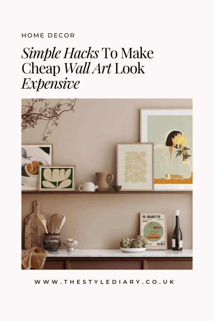
- Use easels and ledges for depth
- Mix hanging and leaning pieces
Theme Development
- Create intentional collections
- Use consistent colour palettes
- Maintain stylistic harmony
6. Maintenance Tips for Lasting Luxury
Keep your art looking expensive with these care guidelines:
- Clean frames regularly with appropriate materials
- Rotate pieces to prevent sun damage
- Check and adjust alignment monthly
Save on Pinterest for later?

Where Can I Buy Budget-Friendly Quality Art?
- Online print shops
- Student art sales
- Digital downloads
- Vintage book plates
- Photography archives
How Can I Make It All Work Together?
The key to making affordable art look expensive lies in thoughtful curation and presentation. Remember:
- Quality over quantity
- Consistent styling throughout
- Regular maintenance and care
- Strategic placement and lighting
Final Thoughts
Remember, making cheap wall art look expensive isn’t about how much you spend – it’s about how thoughtfully you present each piece.
Start with one or two of these techniques and build from there. Even small changes, like upgrading a frame or adjusting your lighting, can make a significant impact on the overall appearance of your art collection.
What’s your favourite way to display affordable art? Share your tips and photos in the comments below!


